Gaussian Process Regression
In this notebook we will go over a basic example of how to use Squidward for Gaussian process (GP) regression. This is not a tutorial on how GP regression works or should be done; it is merely an example of how to use Squidward for a simple regression problem.
We’ll begin by importing the packages needed to go through these examples!
[1]:
# model with Squidward
from squidward.kernels import distance, kernel_base
from squidward import gpr, validation

# useful visualization functions
import gp_viz

# generate example data
import numpy as np

# plot example data
import matplotlib.pyplot as plt
import seaborn as sns

import warnings
warnings.filterwarnings("ignore")
1D Regression Example
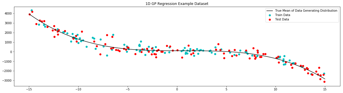
To demonstrate regression with squidward we will use a very simple one dimensional regression example. Here we generate a simple 1D train set, fit a GP to that data, and display the mean and variance of our predictions in an easy to interpret plot.
[2]:
# generate noisy samples for dataset
samples = 100

# train data
x_train = np.random.uniform(-15,15,samples)
noise = np.random.normal(0,350,samples)
y_train = (1-x_train)**3-(1-x_train)**2+100+noise

# test data
x_test = np.random.uniform(-15,15,samples)
noise = np.random.normal(0,350,samples)
y_test = (1-x_test)**3-(1-x_test)**2+100+noise

# generate noiseless data to plot true mean
x_true = np.linspace(-15,15,1000)
y_true = (1-x_true)**3-(1-x_true)**2+100
[3]:
# plot example dataset
plt.figure(figsize=(20,5))
plt.title('1D GP Regression Example Dataset')
plt.scatter(x_train,y_train,label='Train Data', c='c')
plt.scatter(x_test,y_test,label='Test Data', c='r')
plt.plot(x_true,y_true,label='True Mean of Data Generating Distribution', c='k')
plt.legend()
plt.show()
[4]:
# define the distance function used by the kernel
# for this example we use the radial basis function
# you can use one of the default distance functions
# supported by squidward (like RBF) or supply your own
# distance function (as long as it results in a positive
# semi-definite kernel)
d = distance.RBF(5.0,10000.0**2)
[5]:
# the kernel base class takes the distance measure of choice
# as well as the method for evaluating the kernel (the default
# is k1 which is analogous to the scipy.distance.cdit fuction v1.2.0)
kernel = kernel_base.Kernel(d, 'k1')
[7]:
# the model is instantiated with the kernel
# object as well as a likelihood variance (equivalent
# of a white noise kernel to model data noise)
# there is also a variety of choices for matrix
# inversion methods that trade of numeric stability and speed
model = gpr.GaussianProcessInversion(kernel=kernel, var_l=1050**2, inv_method='solve', show_warnings=False)
[8]:
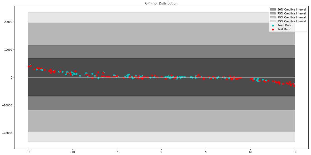
# generate data to plot prior of model
x = np.linspace(-15,15,100)

# pull parameters of the prior distribution
mean, var = model.prior_predict(x)

# plot prior of model
plt.figure(figsize=(20,10))
plt.title("GP Prior Distribution")
gp_viz.regression.plot_1d(x,mean,var[:,0])
plt.scatter(x_train,y_train,label='Train Data', c='c')
plt.scatter(x_test,y_test,label='Test Data', c='r')
plt.legend()
plt.show()
[9]:
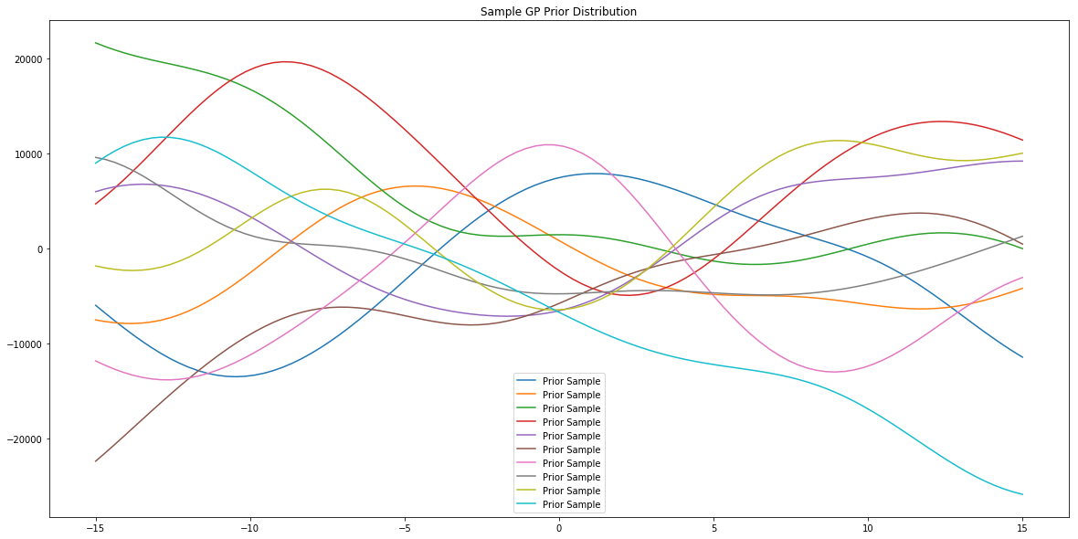
# generate data to plot prior samples of model
x = np.linspace(-15,15,100)

# plot posterior of the model
plt.figure(figsize=(20,10))
plt.title("Sample GP Prior Distribution")
for i in range(10):
    sample = model.prior_sample(x)
    plt.plot(x, sample, label='Prior Sample')
plt.legend()
plt.show()
[10]:
# the model object is largely inspired by the
# scikitlearn interface
# simply call fit to "train" the model
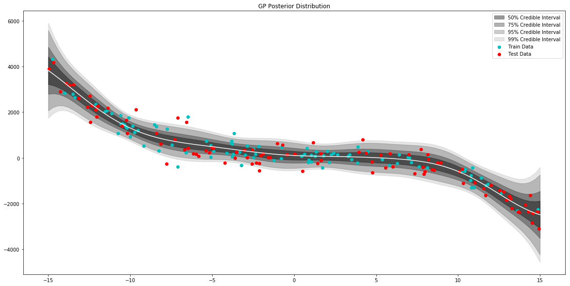
model.fit(x_train,y_train)
[11]:
# generate data to plot posterior of model
x = np.linspace(-15,15,100)

# pull the parameters of the posterior distribution
mean, var = model.posterior_predict(x)

# plot posterior of model
plt.figure(figsize=(20,10))
plt.title("GP Posterior Distribution")
gp_viz.regression.plot_1d(x,mean,var[:,0])
plt.scatter(x_train,y_train,label='Train Data', c='c')
plt.scatter(x_test,y_test,label='Test Data', c='r')
plt.legend()
plt.show()
[12]:
# do basic regression validation

mean, var = model.posterior_predict(x_train)
train_acc = validation.rmse(mean,y_train)

mean, var = model.posterior_predict(x_test)
test_acc = validation.rmse(mean,y_test)

print("Train RMSE: {}\nTest RMSE: {}".format(train_acc,test_acc))
Train RMSE: 319.70145133317754
Test RMSE: 390.31184189505524
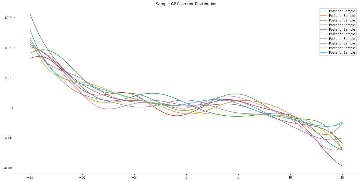
[13]:
x = np.linspace(-15,15,100)

# plot posterior of model
plt.figure(figsize=(20,10))
plt.title("Sample GP Posterior Distribution")
for i in range(10):
    sample = model.posterior_sample(x)
    plt.plot(x, sample, label='Posterior Sample')
plt.legend()
plt.show()
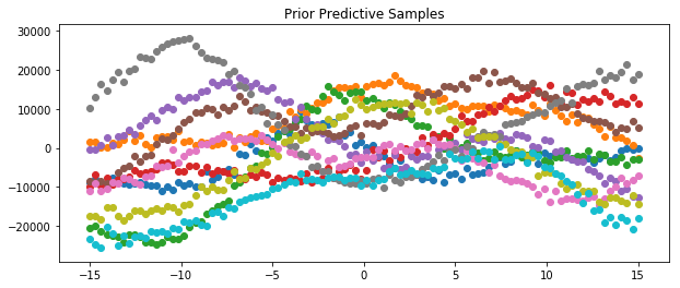
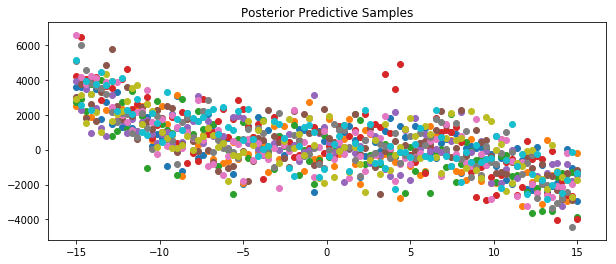
Prior and Posterior Predictive
We can also draw samples from the prior and posterior predictives. Examples of how to do this for the model specified above are shown below.
[48]:
x = np.linspace(-15,15,100)

plt.figure(figsize=(10, 4))
plt.title("Prior Predictive Samples")

for i in range(10):

    # draw a sample from the prior
    prior_sample = model.prior_sample(x)

    # add likelihood noise
    liklihood_noise = model.var_l * np.ones(100)
    liklihood_noise = np.diag(liklihood_noise)
    prior_predictive_sample = np.random.multivariate_normal(mean=prior_sample, cov=liklihood_noise, size=1)

    plt.scatter(x, prior_predictive_sample)

plt.show()
[47]:
x = np.linspace(-15,15,100)

plt.figure(figsize=(10, 4))
plt.title("Posterior Predictive Samples")

for i in range(10):

    # draw a sample from the prior
    posterior_sample = model.posterior_sample(x)

    # add likelihood noise
    liklihood_noise = model.var_l * np.ones(100)
    liklihood_noise = np.diag(liklihood_noise)
    posterior_predictive_sample = np.random.multivariate_normal(mean=posterior_sample, cov=liklihood_noise, size=1)

    plt.scatter(x, posterior_predictive_sample)

plt.show()
[ ]: